
Richer Sounds is a leading UK retailer of TVs, HiFi, and home entertainment products. The company has a strong reputation for customer service and value for money. In recent years, Richer Sounds has seen increasing demand for its products online. To meet this demand, the company decided to redesign its ecommerce website.
The redesign of the website was a complex project that involved extensive user research and design. The goal was to create a website that was both user-friendly and visually appealing. The website also needed to be responsive, so that it could be accessed on a variety of devices.
The user research phase involved interviewing potential customers and observing them as they used the existing website. This research helped to identify the key pain points that users were experiencing. The design phase involved creating wireframes and prototypes, which were tested with users to get their feedback.

01. The biggest friction point on site
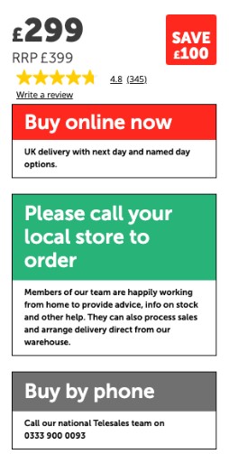
The weakest experience on-site is the add to bag buttons on PDP. Every user tester paused and questioned how to add to bag. Further friction was caused by the Buy In Store “button” taking precedence over the add to bag button because of its green colour.
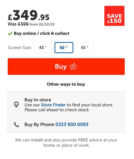
We have already redesigned this section for the rebuild.
We can tweak the new design for use in the current site. Specifically, we would need to amend the buy in-store message to a COVID-19 created one.
Before
New design


02. Products that can’t be bought online
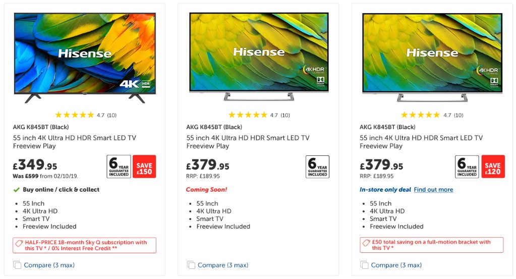
These products are causing friction for users who want to buy online. Currently, it is not clear to users that they need to go in-store/call to buy these products and some of the user testers failed to complete their tasks because they could not figure out how to add a product to their bag.

Every product has a green tick giving the affordance that they can all be bought online. Actually only the one on the right is available online.
New design
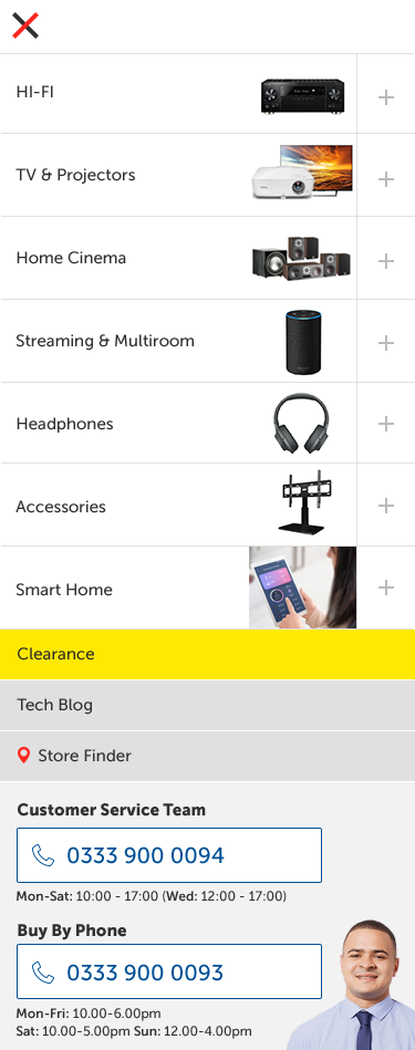
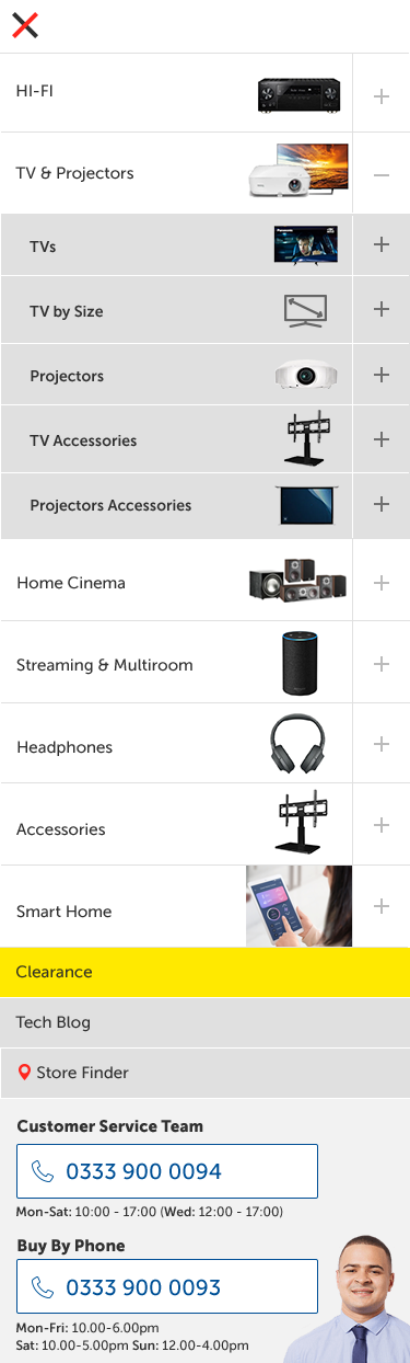
Mobile navigation
")
")
")
")

Leave a Reply