
In 2019, I completed a professional UX diploma from UX Design Institute. I was already working as a UX designer for Space 48, specializing in ecommerce, but I took the opportunity to pursue further education as part of my personal development.
One of the most rewarding aspects of the diploma was the chance to work on a more exciting variety of problems and journeys than I wouldn’t normally encounter in my day-to-day work. This helped me to expand my skills and knowledge, and it also gave me a new perspective on UX design.
After completing the diploma, I was able to use my new skills and knowledge to create a range of UX products and services for Space 48 in the form of a UX playbook. This playbook helped to improve the company’s UX research capabilities, which was a major game-changer for them.
The diploma also prompted me to move on in search of bigger and better projects to work on. I am now a UX designer at a large tech company, and I am excited to continue my career in this field.
02. The diploma
The Professional Diploma in UX Design is credit-rated by Glasgow Caledonian University. It covers everything needed to become a certified UX professional.
As part of the course work we where required to research and design a new flight booking app. We started with user research carrying out competitive benchmarking, surveys, depth interviews and user moderated tests.
Once we have information gathered we moved on to design, covering navigation, interaction design, low fidelity wireframes and prototyping.


03. Low fidelity designs
Here are a few of the low fidelity wireframes of my version of the flight booking app. I focused on long haul flights which present a slightly different set of needs than a short haul budget airline, especially around time zones and layovers.


User Research
- Competitive benchmarking: We looked at the leading flight booking apps to see what they were doing well and where they could be improved.
- Surveys: We surveyed potential users of our app to get their feedback on their needs and wants.
- Depth interviews: We conducted in-depth interviews with potential users to get a better understanding of their pain points and motivations.
- User moderated tests: We invited potential users to test our app prototypes and give us feedback on their usability.
Design
- Navigation: We designed a clear and intuitive navigation system that would make it easy for users to find what they were looking for.
- Interaction: We designed a fluid and responsive interaction design that would make it easy for users to interact with the app.
- Low fidelity: We created low fidelity wireframes and prototypes to test our design ideas and get feedback from users.
- Prototyping: We created high fidelity prototypes to demonstrate our final design to stakeholders.
Colour coded calendar view
One of the biggest pain points for users when booking flights is comparing the price difference between different days in a month. This can be a time-consuming and frustrating process, especially for users who are planning a long-haul flight far in advance.
To address this issue, I created a colour-coded calendar view that makes it easy for users to see the price difference between different days. The calendar is colour-coded by price, with the cheapest days being light pink and the most expensive days being dark pink. This makes it easy for users to quickly scan the calendar and find the best days to travel.
In addition to making it easier for users to compare prices, the colour-coded calendar view also closes down the users research window reducing opportunities for competition to sneak in and pinch a prospective customer or for the user to become exasperated with your site and to seek a better experience elsewhere.
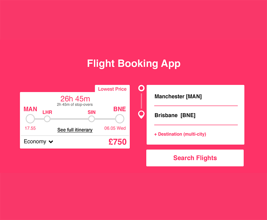
Visual flight times & layovers
Another major pain point for users booking long-haul flights is understanding the outbound time, landing time, flight time, and layovers. To address this issue, I created a visual graphic that represents the number of layovers and at what point in the overall flight they sit. I also included concise time information regarding the duration of the flight, the duration of the layovers, and the day and time the user will arrive. This removes the need for the user to figure out this information for themselves based on landing times alone.
If a user is comparing multiple flights and having to do all the calculations in their head, they will burn out their concentration very quickly. This visual layout allows them to just compare the options without the need for working out or physical notes.
I believe this experience will bring users back to the site because it is easier to use, reduce user errors when booking, and caters for those with learning difficulties such as dyscalculia.
Leave a Reply